UI Design: Plugin
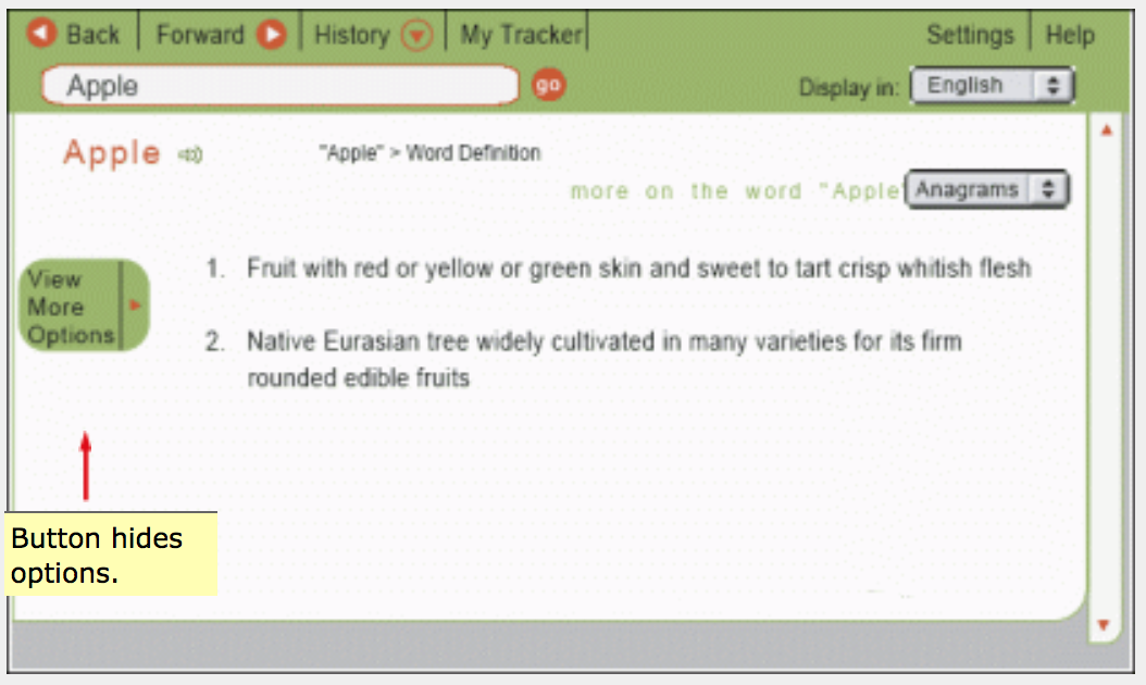
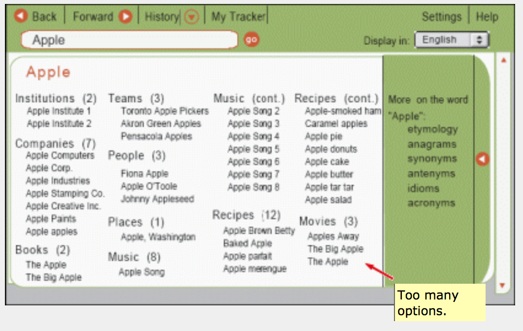
This plugin offered the user a popup module with multiple types of information about an individual word. The popup was launched by selecting the word, right-clicking, and selecting the plugin from a contextual menu. The initial version of the popup presented the user with a definition of the word, along with a “View More Options” button. Clicking the button opened a windowpane panel full of listings, along with another “More” option:


This is a case of the interface initially displaying too little information and then too much. At first the user does not know what options are available (“mystery meat”). After clicking the button the user is presented with too many categories and subcategories, requiring tedious scanning. A middle ground between these extremes will work better.
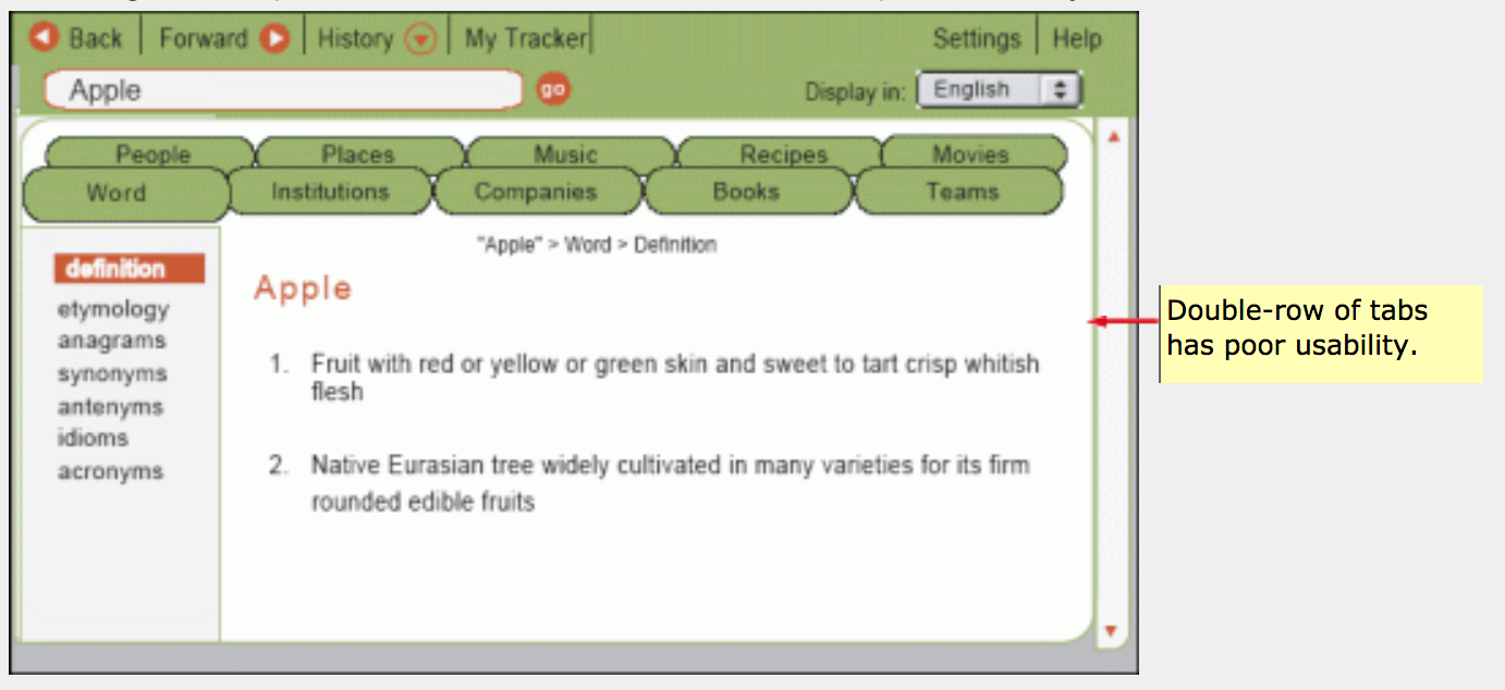
As an experiment I created a tabbed interface since this is an appropriate use of tabs (alternate views of a single information piece) but the amount of categories required a double-row of tabs, which has poor usability:

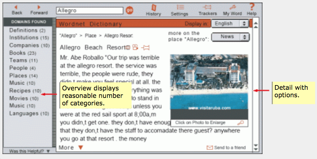
Removing the tabs give us a usable interface (see below) and the concept of “overview plus detail” is sound.
