Case Study: The Dual Role of UX in the Discovery of Complex Systems
Introduction
The Discovery phase of a new project is especially challenging in projects involving complex systems, because of the challenge of achieving a shared understanding given the number of processes and variables involved. By “complex systems” I mean systems constructed of multiple subcomponents, often built at different times, with multiple handoffs and steps. In big corporations these are sometimes built on a legacy code base that is not easily updated.
User Experience practitioners have dual roles in this situation: helping end-users by using traditional discovery methods to determine their needs, and helping team members by using effective UX principles to provide knowledge about the systems underlying the project.
Some might say that system architecture is irrelevant to ground-level problem-statement discovery, however in the Discovery phase of a Design Thinking project (IBM is dedicated to what they call Enterprise Design Thinking), you have not yet identified all of your users, tasks and touchpoints. Understanding the existing structure, and it’s scope, is essential to figuring out what the “right problem” is.
Comprehension vs. Apprehension
If your team doesn’t understand a system they will fearfully jump into the solution space just to feel comfortable. This can short-circuit Discovery and result in solving the wrong problem.
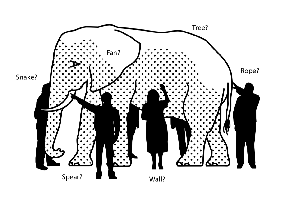
6 Blind People and an Elephant
A group of blind people encounter an elephant. None has ever been near one before. Each feels a different part of the elephant’s body, but only one part, such as the side or the tusk. They then describe the elephant based on their limited experience, and their descriptions of the elephant are different from each other. In some versions, they come to suspect that the other person is dishonest and they come to blows. The moral of the parable is that humans have a tendency to claim absolute truth based on their limited, subjective experience as they ignore other people’s limited, subjective experiences which may be equally true. Source: Wikipedia
Corporate systems can be difficult to comprehend. One of the disadvantages of large corporations is that the components of their systems: workflow, production, design, etc. have often been cobbled together over time. This is especially true for areas of functionality that are not seen as immediate revenue-providers, which tend to be updated less-frequently. Old codebases can be seen as “good enough”, and managers are less likely to be promoted for streamlining existing processes versus introducing new product lines.
These systems can contain gaping inefficiencies, and be run by employees who must employ heroic efforts to get simple things done. This sounds like a perfect opportunity for a UX overhaul, but it’s not without barriers. One is the fact that some employees will guard their dominion over arcane workflows as a form of job security, preferring that things remain obscure in order to be seen as indispensable. Another is the sheer heavy lifting involved in understanding these workflows.
IBM’s globalization practice, the translation of web pages to different languages, was one of these systems. I was tasked with designing a process that would better track its “velocity”, units of translation work completed in a given timeframe. But with a little digging it became apparent that the “problem space” was much larger than velocity measurement. The globalization system consisted of old code, underpowered databases, laborious manual tracking, and heuristically-challenged user interfaces. User interviews and user testing opened the door to new areas of functionality that were failing. Improving the speed and ease-of-use of the ibm.com translation process would provide a far greater return than optimizing measurement. Focusing on velocity would be like adding a speedometer to a car with square wheels.

“Shut up”
Agile and User Experience guru Jeff Patton has said “the word ‘requirements’ means ‘shut up.’” His reasoning is that requirements represent decisions, and decisions already made stifle discussion (Jeff Patton, “Requirements Considered Harmful”) . When I joined the team there already was a preliminary PRD (Product Requirements Document) in place. This document had been put together by business analysts and the project manager, and was required for quarterly planning and budgeting. My challenge was validate the PRD, but also to point out opportunities that weren’t yet discovered. I soon found out that nobody had a complete overview of the globalization process.
Discovery Methods
I felt like I was holding the tail of the elephant. Translation progressed through a series of handoffs between translation managers, translators, a machine-translation vendor, Q&A people, localizers and managers. Individual country units had to use budget in order to publish translated pages, so there was a shopping cart component.
My Discovery methods were questionnaires, user testing, interviews with users, subject matter experts, and stakeholders, along with reviews of existing documentation. Most participants were siloed: users who did QA had no idea about budgeting, machine learning vendors didn’t know about batch submission. One might say they didn’t need to know, but the project team required at least a basic understanding of how the parts fit together.
Pain Points
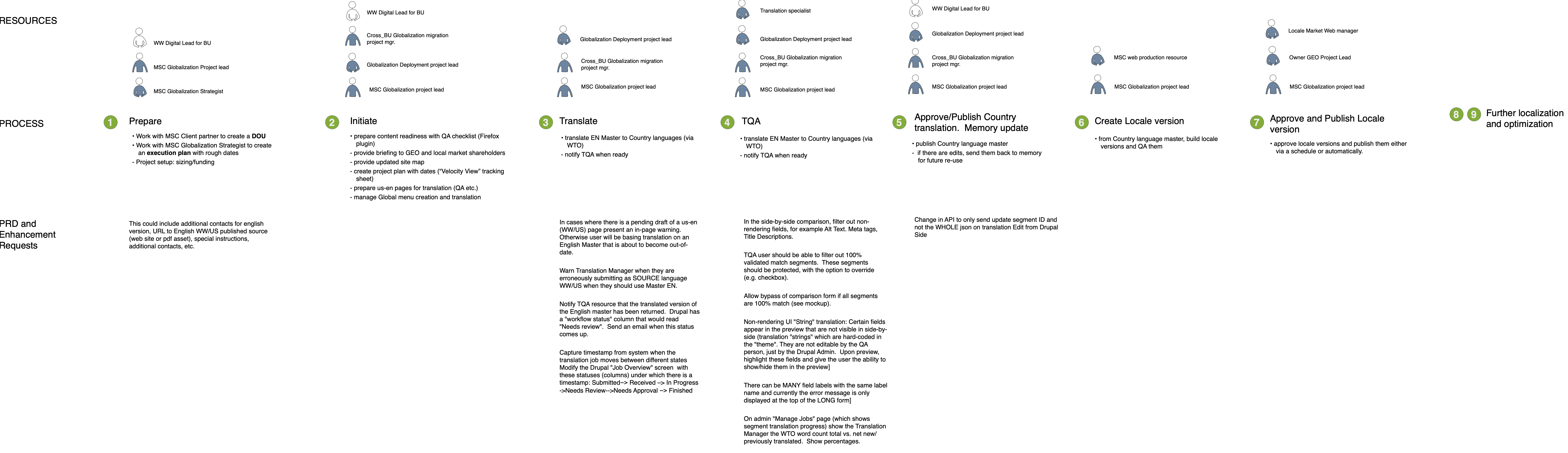
I created a rough overview of roles, resources and tasks:
As a part of doing user interviews about the velocity measurement process, I began to discover some ground-level usability opportunities, for example, though most translation was done by machine, human QA experts had to review the output in extremely long forms. When errors occurred they were very difficult to fix. A particularly egregious instance occurred when machines would occasionally create translations that were above a set character limit:

These error messages appeared not “in situ” but only at the top of a very long form, which contained duplicate labels. QA specialists would have to manually count characters in order to discover where the actual error was. This was very tedious.
Although we were not in the solution space, a general remedies were obvious: eliminate duplicate fields, provide direct links to erroneous fields, which should be labeled, use a character counter.
Iterating For Better Understanding
The Translation overview screen shown earlier was hard for the team to digest, it was too big and too detailed.
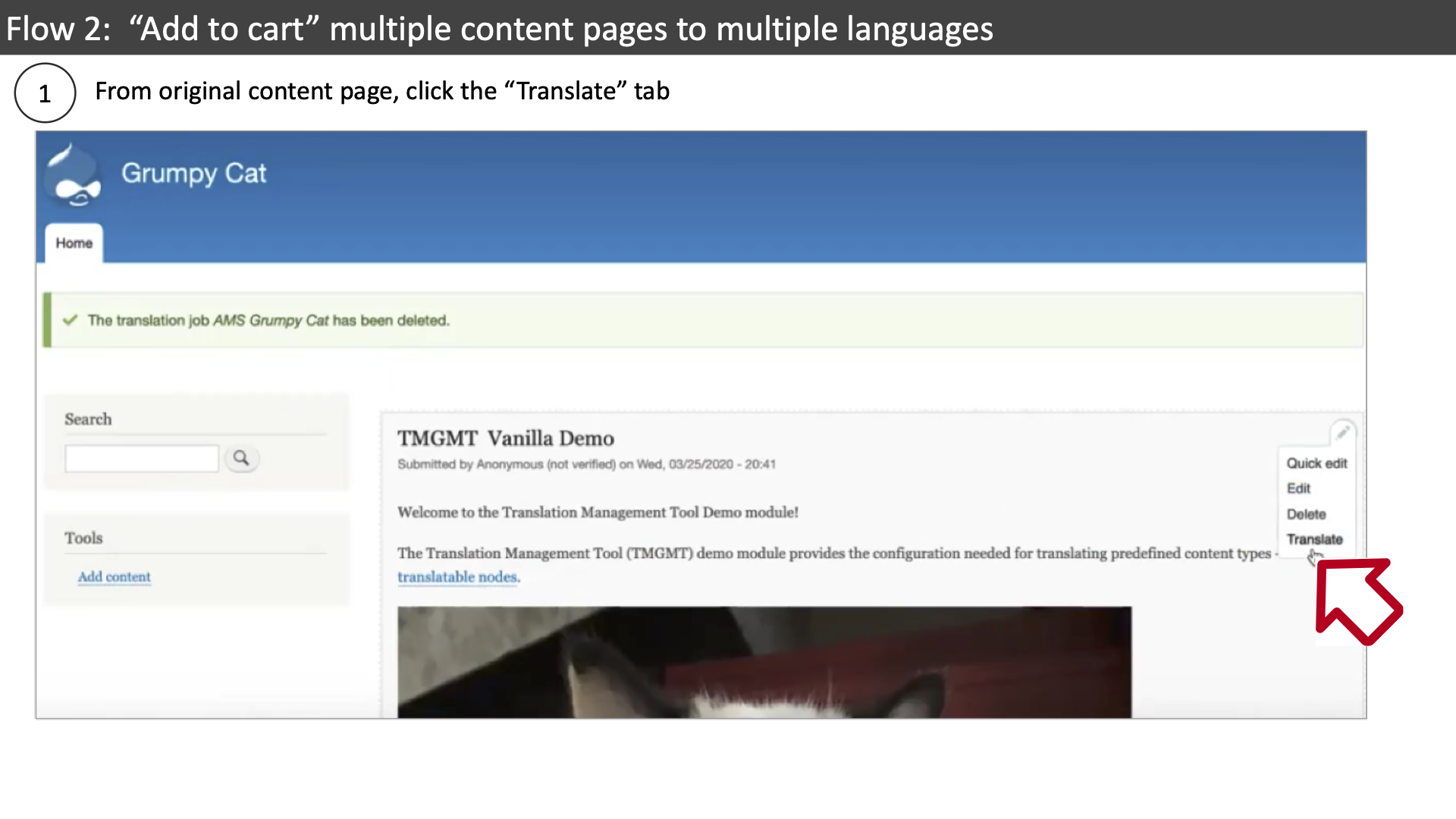
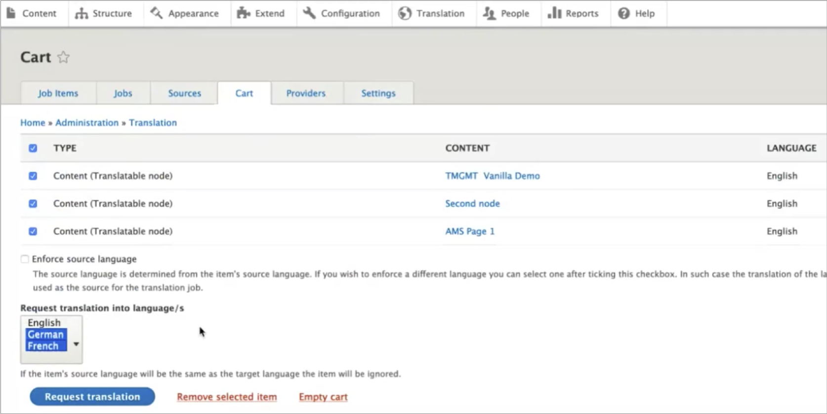
I decided to take a different approach, to map out subprocesses in a more step-by-step way. One of these was the “checkout” process, the means by which company divisions could select ibm.com web pages to request that they be translated into other languages. My first attempt was to show a process flow mapped to individual screenshots:
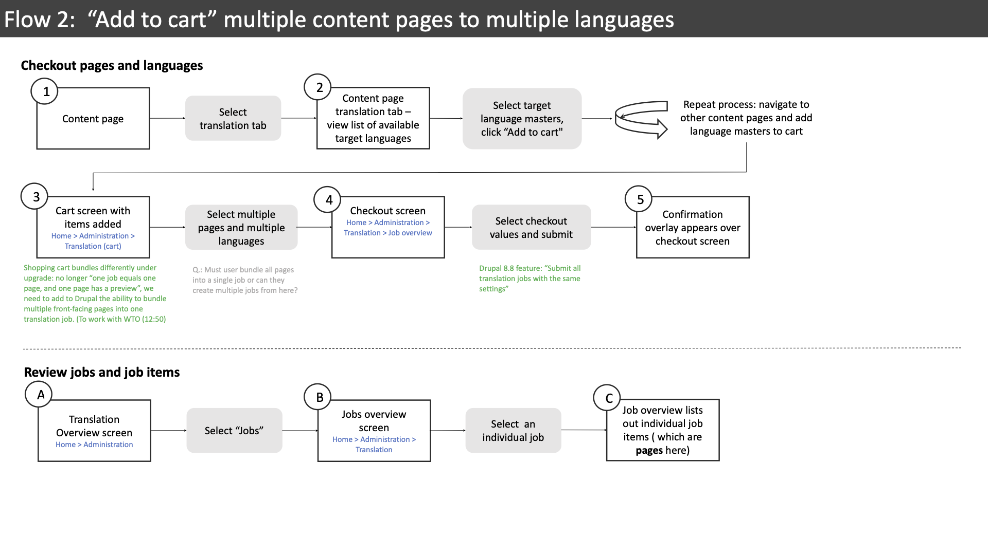
The numbers here correspond to screenshots (see below):
The checkout process consisted of 3 of these flows. The project team also had difficulty comprehending this type of presentation. Although it was an accurate representation, it was linear. It was difficult to map a screenshot back to its place in the process flow. Also this method didn’t show the relationship between the flows.
I decided a better approach would be to mix a process flow with an entity diagram:
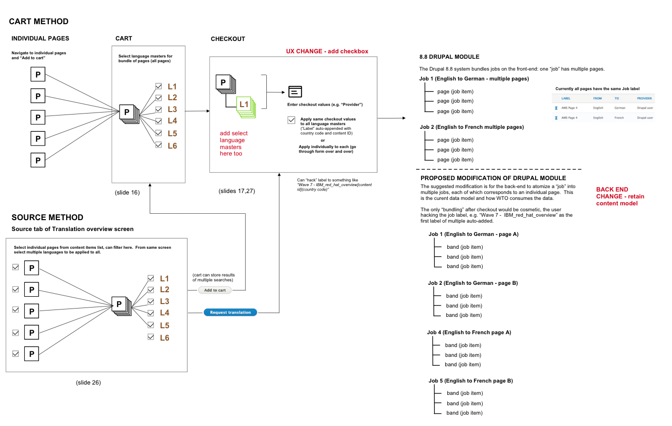
Although this might look more complicated, it captures the entirety of the subsystem, and shows overlaps in flows that would otherwise be difficult to parse out. In this case it illustrates that the selection of “language masters” was beng requested in 3 places: prior to adding pages to the cart, in the cart, and in the final checkout process. Visualizing a component repeat 3 times in the same diagram is more powerful than looking at 3 process flows, each of which has an example of that component.
However this entity diagram was lacking a “street view”, a view of individual pages. Returning to the language master selection issue, another problem was that users in the checkout screen had to re-affirm language selection individually. The combination of an overview diagram that enabled wayfinding in a poorly-designed workflow, and a detail view that revealed page-level problems, helped the team remove redundancies and come up with work-saving ideas like batch checkout.
If you don’t map out all the paths, you may be unaware of back-entry methods for performing tasks, or you might only have interviewed users who took the “bad” path.
I then brought these diagrams together in an “Overview plus detail” UX pattern: a clickable prototype that showed both entities, flows, and pages.
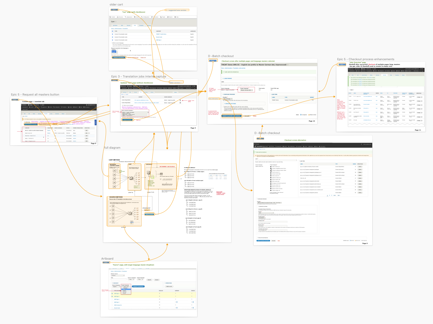
The result of seeing the full scope of this process was that the team was able to better recognize redundancies, and became willing to modify requirements . The alternative, feedback from individual users, might miss some of these systemic issues, because each user had their own way of navigating the system. Each had their own conception of the elephant. In the end, the opportunities revealed by this method became a viable alternative to the requirements in the PRD, which had proven to be too ambitious for the project’s timeline and budget.
Lessons Learned
IBM offers an Enterprise Design Thinking course with recommendations on the best way to do Discovery. The emphasis is on collaboration and building empathy within the team, through artifacts like a “Hopes vs. Fears” list, an “Assumptions and Questions” grid, a shared wall for validated assumptions, a team ecosystem diagram, and a stakeholder map listing their wants and needs.
I haven’t been fortunate enough to work on a project like that. The obstacles I faced in Globalization were a group mentality of the document-as-the-project, and a lack of subject matter expert support, to the point where I felt if I was “information-sipping”. My alternative was to case a wide net, including going screen-by-screen through product demos, in order to map the overall system, to pick up and validate pain points through user testing and interviews, and to create a shared common object.
My verdict is that this was partially successful. The team began to count on me as the source of truth for the system, and to request solutions rather than problem statements, in order to feed the PRD and satisfy stakeholders. At times I felt like a Discovery service bureau.
If I had to do it again, I would request that the main subject matter expert be at least half-time on the project, that the PRD requirements be changed to problem statements, and that as a team we would engage in some of the empathy-building exercises that IBM, in their Enterprise Design Thinking training, recommends.
More Case Studies
Also see my traditional Work Samples
Case study: Responsive Trip Configurator
It’s much easier to take a spontaneous trip when you can “make it up as you go along”.
Case Study: Marketing Campaign Management platform
IBM finally recognizes its most-neglected user, the IBM employee.