< back to UI Design
Compare forms: Neighborhood selector
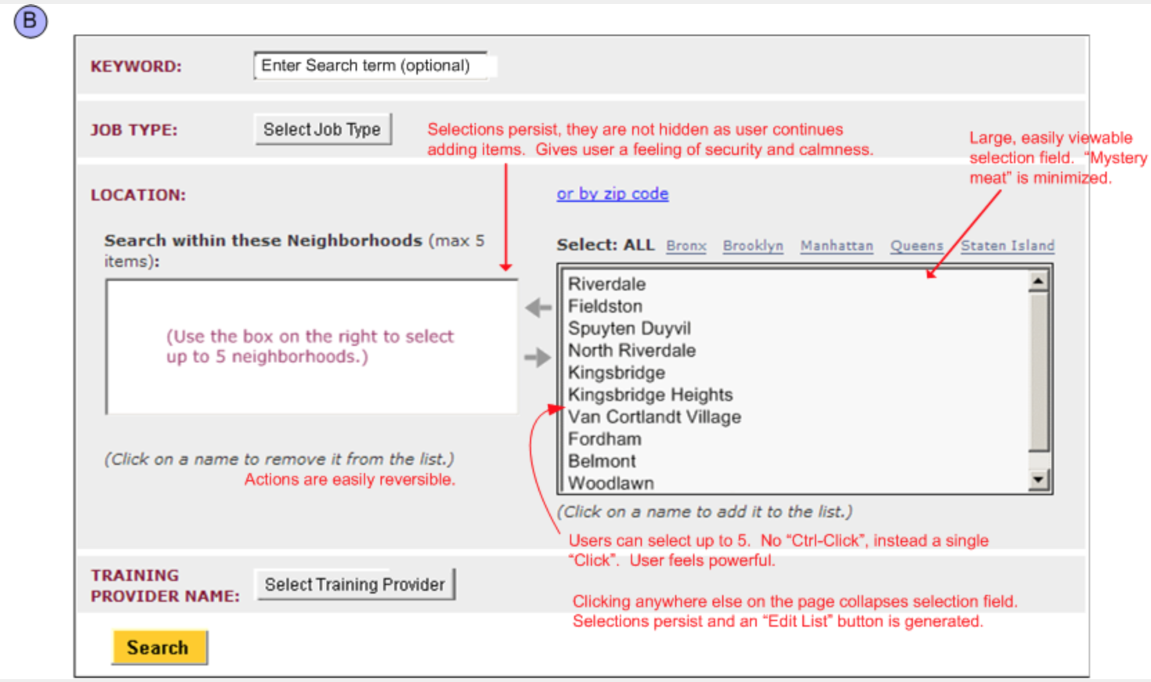
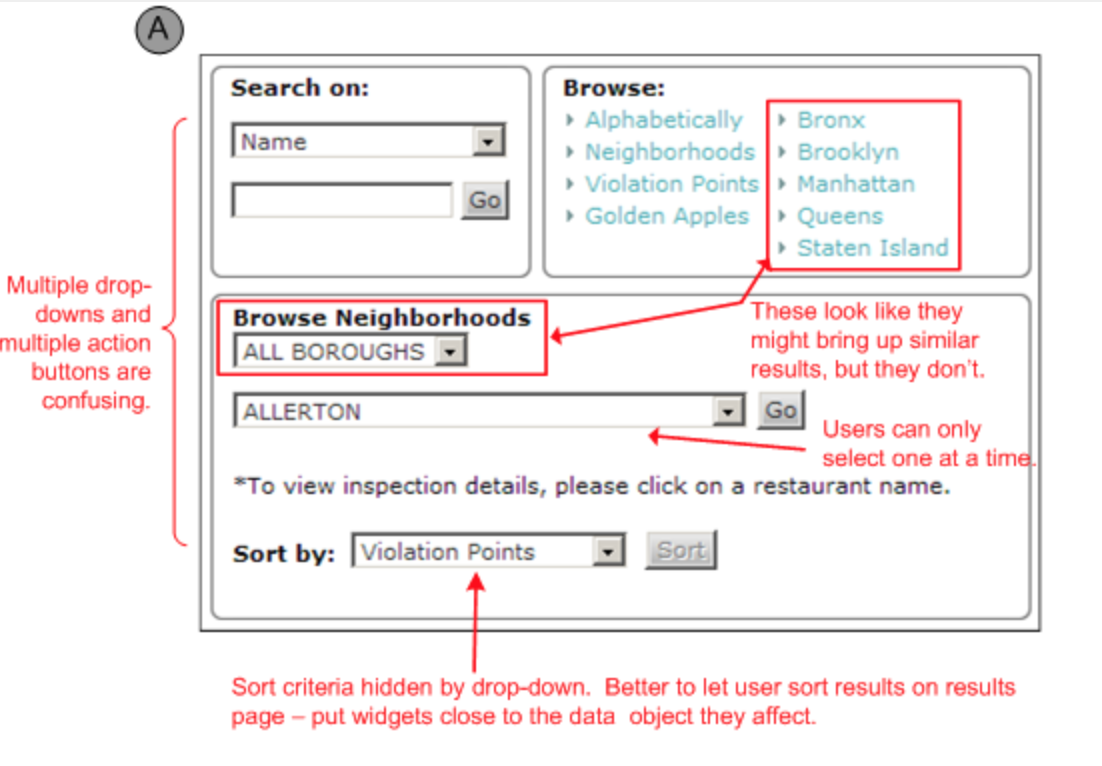
This is a comparison of two different search interfaces designed to enable a user to use “neighborhood” as a criterion. Example “A” is part of of a City of NY Restaurant Inspection Information website. Example “B” I created for the City of NY online Training Provider Directory. In both cases there are multiple search criteria available, of which “neighborhood” is only one.
Example “A” confuses the user with two competing methods for browsing neighborhoods, along with a “Neighborhoods” text link that still appears to be active. Can the keyword search be combined with a neighborhood “browse”? What search criteria are hidden in the multiple drop-downs? Why is sorting done on the search screen instead of the results screen? What should I do with all these action buttons?
Example “B”, below, expands functionality by allowing the user to select multiple neighborhoods at the same time, and simplifies design since there are no mysterious combinations of drop-downs and action buttons.
Visually the various search criteria are handled equally, implying that they are additive. Neighborhood selection is done with a single-click on an item, which moves it to the “selected” panel, and is reversed just as easily. The arrows between the “selected” and “available” boxes are not buttons (because of the single-click selection method buttons are not needed) so they do not look like buttons, they have no bounding box and are slightly grayed-out. This solution is more powerful, simpler, and creates a better user-experience.