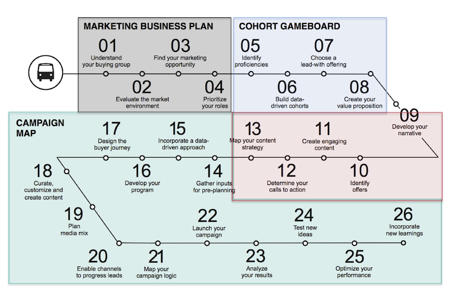
Case Study: IBM’s Marketer Workspace
Helping users help users
The Challenge:
IBM marketing managers were using dozens of non-standardized tools in a multistep process to create marketing campaigns. Manual input created errors and constant rework. Teams were frustrated and morale was low.
My Role:
I was UX Lead on an Agile team that included a product owner, several developers, a graphic designer, two-part time user researchers, and a database architect.
The Outcome:
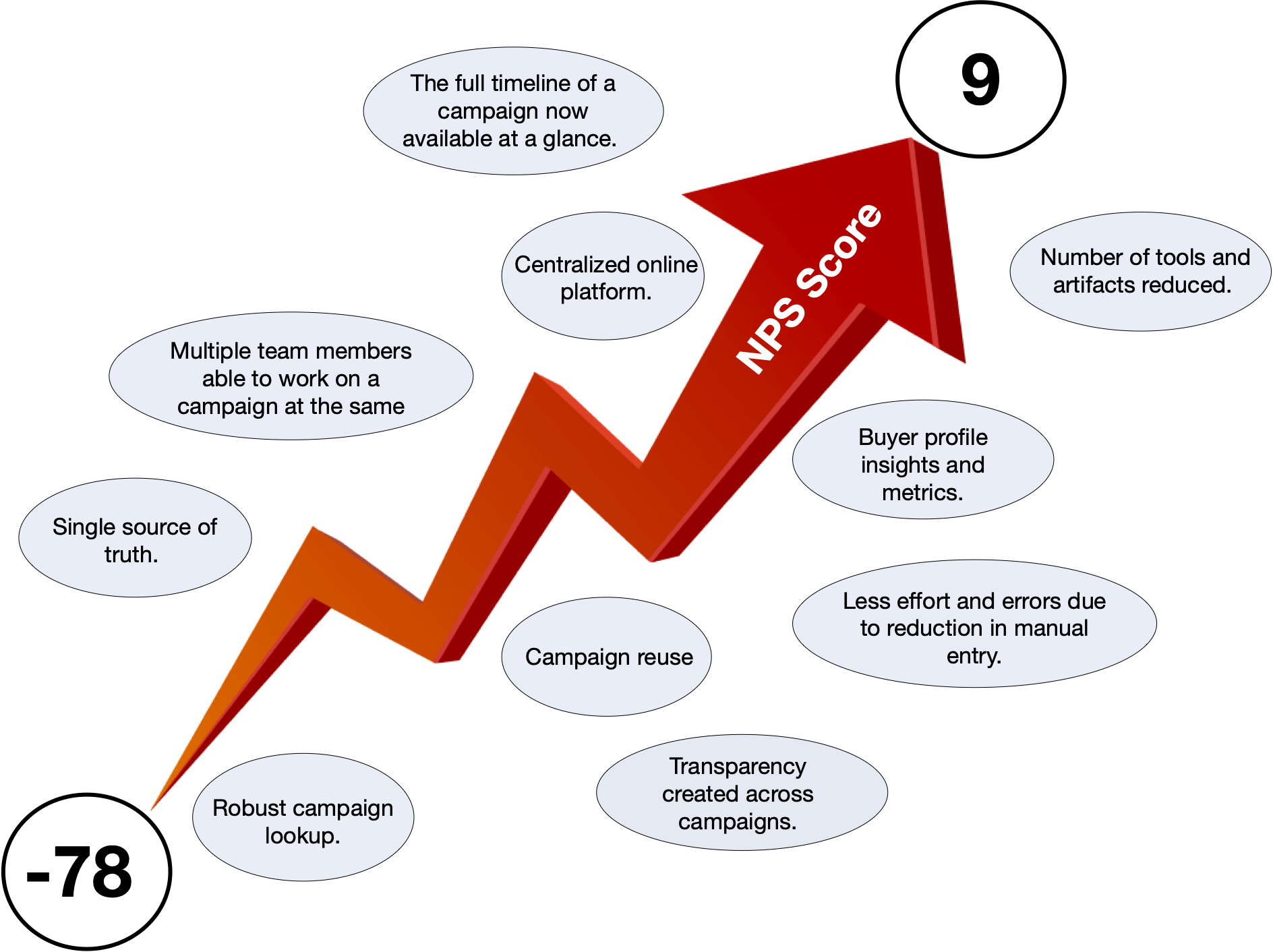
Marketers were provided with a new, centralized campaign management platform which reduced redundant data entry, eased handoffs, and allowed users to work on a campaign simultaneously in a non-linear fashion. Marketers could now access contextual buyer insights and metrics. This was done via an intuitive drag-and-drop interface. NPS scores rose from -78 to 9.
Lessons Learned:
- Users’ “workarounds” are a the ultimate user test and a rich ground for new features
- Don’t design tools that aren’t the result of specific pain points
- Competition between groups over naming or permissions is about something other than the best user experience
My Approach
This project required designing a system, a platform of multiple interoperable tools, serving multiple users.
To reign in complexity, I needed a system myself: one that encompassed processes, tools, guidelines, and people. I decided to use scrum-focused Agile, Jira, and Design Thinking.
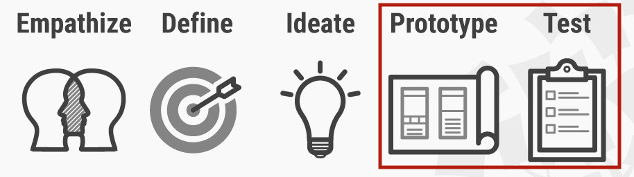
Design Thinking was the best fit because of its emphasis on context. When juggling so many variables, I needed an approach that could help determine which ones were essential. Understanding users in context, empathizing, was the way to do this.
Empathize, the first stage in Design Thinking, doesn’t just mean feeling your user’s pain. It means learning from them as well. Users create their own workaround solutions, and may have priorities that are quite different from what you might expect. Both were the case here.
When empathizing with multiple users it was important to essentialize: to identify the core users who created marketing campaigns, and to determine which solutions would have the greatest impact. It was also crucial to identify elements that could not be changed.
One of the things that could not be changed was a new, mandated 26-step marketing process. A primary goal of this new process was to change IBM’s marketing philosophy from being product-centric to being customer-centric. The focus on the end user was commendable, however it seemed that no one was paying attention to the growing complexity of the marketer role.
Identifying users
Through user interviews, workshops, shadowing, and sitting in on campaign planning and coaching sessions, we began to identify roles, tasks, and tools. At this point it was important to stay in the “problem space” rather than the “solution space”. If fear prompts quick solutioning, the team runs the risk that any new data not in which is not support of this quick solution model will be delegitimized, even if subconsciously.
Instead we took time to listen to users who were happy to tell us of their frustrations, and to offer their own suggestions.
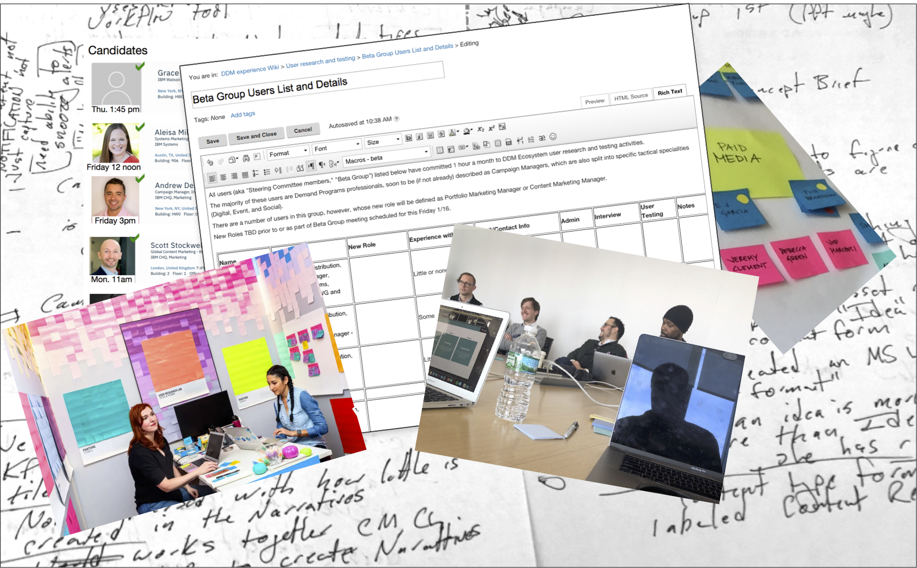
The most useful type of user research for this project was shadowing: actually sitting in with marketing teams as they planned their campaigns. Decisions were made on factors I hadn’t even considered.
For example, I had thought that the most important factor for teams in selecting campaign content was performance. I envisioned customized metrics as a primary feature,
Instead I found that re-use was critical. Teams knew their assets, had seen performance data on them in prior campaigns, and knew their customers. Their campaigns were not being planned sui generis. Thus, re-using assets and their associated nurture streams made sense and saved teams time. With contextual metrics still in their infancy, providing users with easy methods to reuse content and campaign data took the higher priority.
User testing and user research
Included:
– User surveys
– User interviews
– Workshops
– User testing
– Shadowing
Done by two part-time user testing professionals and a UX resource
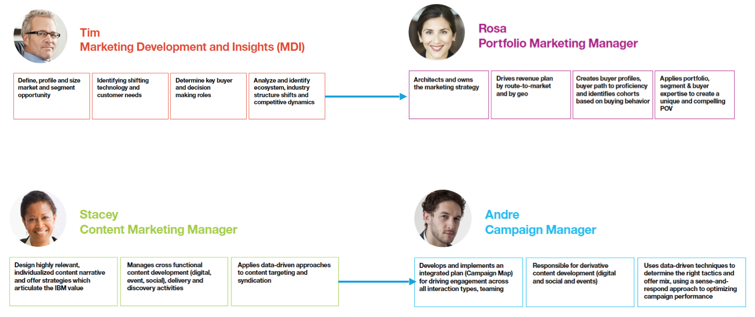
Personas and tasks
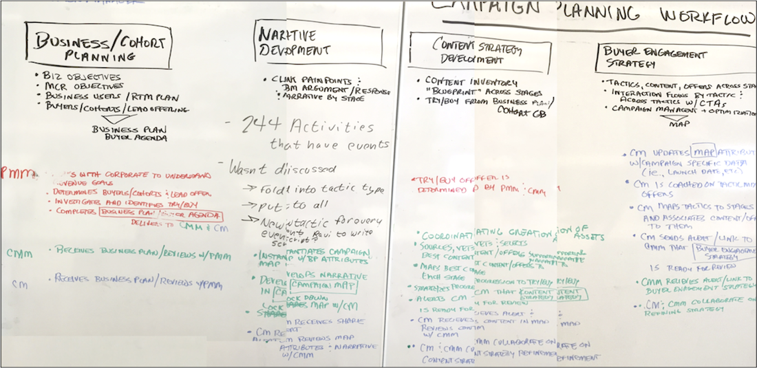
Some persona work had been done already as part of the New Work of Marketing initiative. Through further interviews we learned that each role was tasked with creating their own primary artifact, for example, the Portfolio Marketing Manager would create a “Business Plan” document, the Content Marketing Manager would create a “Content Brief” and a list of potential assets.
The Campaign Manager would wait for these artifacts, copy portions of them, confirm and select assets, plan timelines, work with a digital strategist to on delivery methods, then create a master spreadsheet for an execution platform specialist. There were many handoffs.
Pain points began to emerge:
- Each team member had their own view into a campaign, but there wasn’t a shared overview. We needed to enable a common understanding of the scope, content and progress of the campaign.
- Workflow dependencies slowed teams down. A team member would need to finish work in one tool before another could begin in a different tool. We needed to bring tools together and make them less “waterfall”.
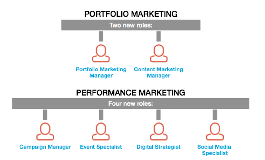
- Some roles collaborated and contributed frequently throughout the campaign planning process. Others had limited roles at limited times. Whatever we built would have to serve both power users and occasional users.
On having internal users
Advantages:
- We had direct access to marketing teams and could sit in on their planning sessions.
- We had internal stakeholders whose main job was coaching marketers on how to make better campaigns.
- When marketers were brought in for training, the trainers allowed me to address them as a group, in order to solicit ongoing feedback
Disadvantages:
- Marketing teams were in flux, new marketing roles had just been created.
- There was disagreement within the company as to whether marketers or content experts controlled the content (assets) within a campaign
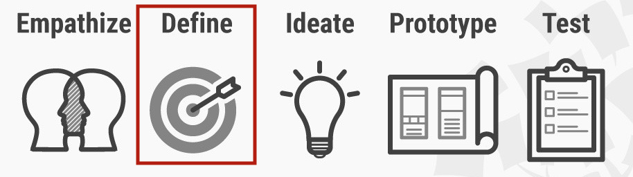
Define overlapped with Empathize. Here we shifted from understanding user mindsets and context, to focus on the specifics of processes and tools. The goal was to coalesce individual pain points into larger themes we could then ideate against.
The Define stage can feel like information overload – there are always more inputs. But as messy as it is, effort here results in more efficiency than in any other stage. Consider the cost of building something that solves the wrong problem.
We were guilty of this – we went into the project with the thought that users would benefit from in-platform task management functionality. We then were so wrapped up in learning the many processes and tools, that we failed to note that teams were happy with their own customized solutions: Trello, Jira, etc, which were flexible. The task-management functionality that was designed was later dropped.
Define Processes
No central document existed to captured the entire campaign creation process. This was something of a “white whale” and attempts had been made using long plotter sheets taped on modular whiteboards. Through workshops and interviews we mapped out larger pieces and compared them to legacy documents, such as powerpoint slides used in onboarding campaign managers.
Through this method we were able to compare how the process was supposed to work vs. how users were actually getting campaigns to market. The complexity of the process and the variability of teams meant that teams had to be flexible in order to complete their required tasks:
- Teams differed in size: on small teams there might not be a content strategist or a paid media specialist. Other roles would fill in. In building a tool it would be best not to overly restrict functionality by role.
- Geography mattered. Typically there would be a central “Global” campaign, that was modified by individual country markets. We needed make cloning of these large campaigns easier.
- There were parallel paths for certain campaign activities, typically those involved with the delivery of assets. It was difficult to keep track of these. An example is creation of targeted email to deliver a link to a software download. The tool should bring asset delivery elements into the overall campaign planning process.
- Teams often reused large portions of previous campaigns. They knew what had worked and what hadn’t, and they wanted to save effort. It should be easy for campaign managers to access old campaigns, and to look into other manager’s campaigns.
Every time?

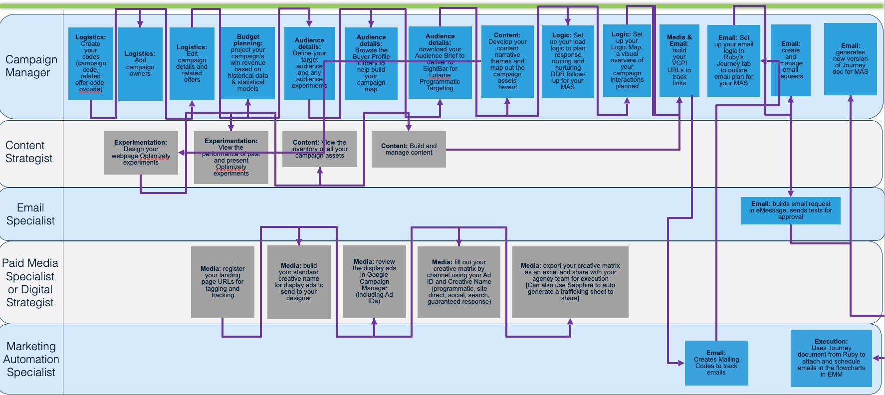
Some processes were incredibly tedious. Users would create Powerpoint flow charts showing how to bring assets to market. For example a flow might show an email nurture stream being used as a channel to deliver a link to a software download offer. In order to implement and measure these assets, users had to manually entered them into three separate systems. First they would create a visualization of the channel activity in Powerpoint, including specific identifiers. Then they had to cut and paste each asset name and related channel data from the Powerpoint document to an Excel spreadsheet. Finally they would export the Excel spreadsheet to a Unica specialist who would key it into that system.
The Powerpoints were continually updated based on budget, performance, and other factors. Each update required editing the flowchart, then finding, editing and calling out the information in Excel, then resending an updated spreadsheet to the execution specialist to be re-entered.
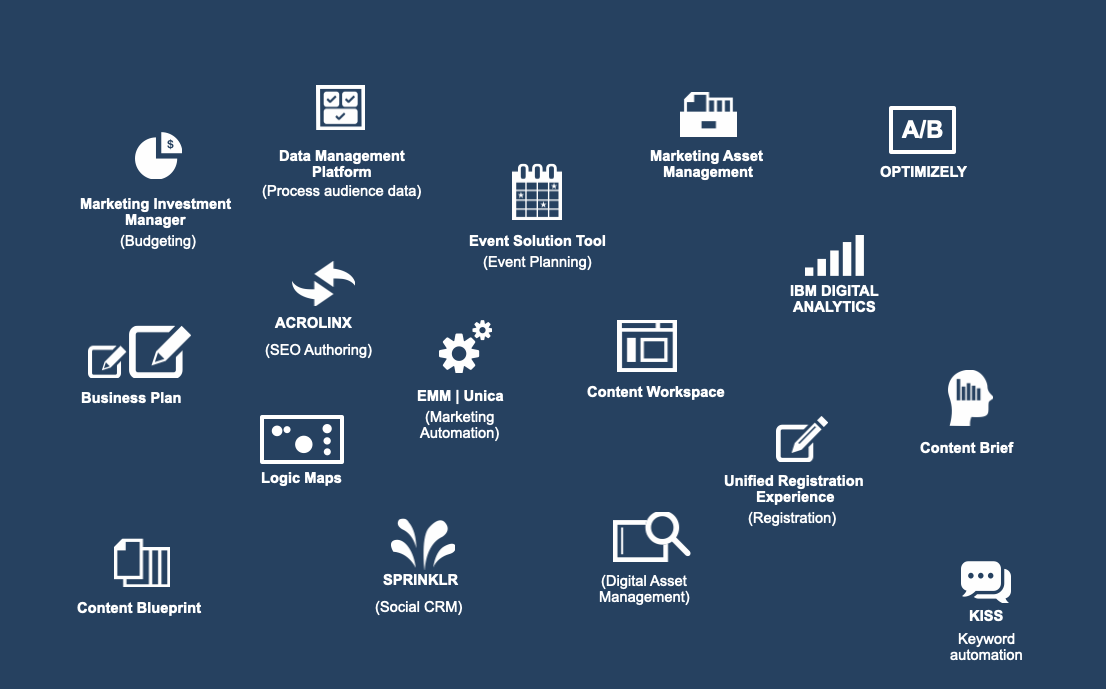
Define Tools
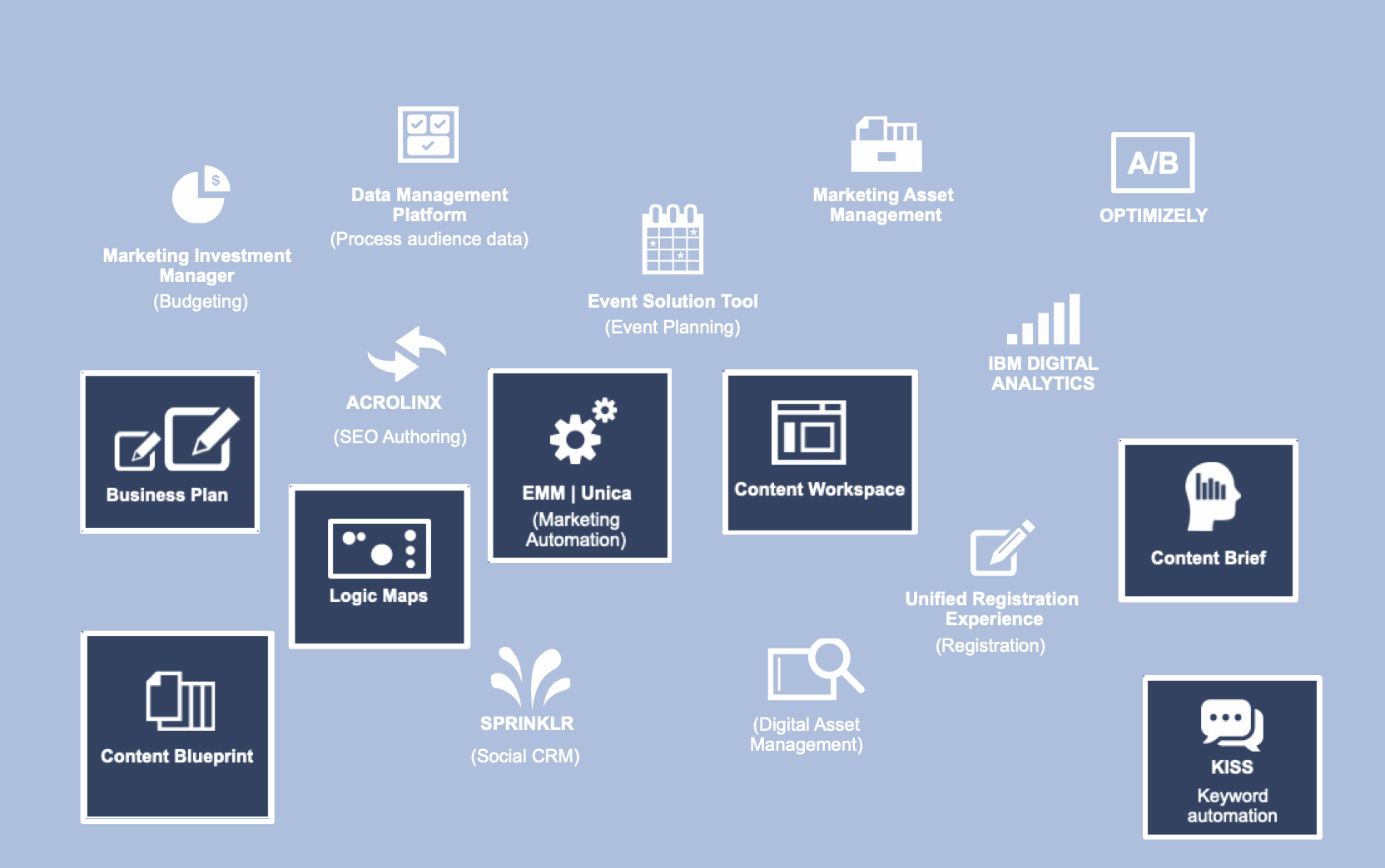
A large toolset added complexity to creating campaigns. Teams faced multiple logins, since single-sign-on was not always available. Not all team members were credentialed. Taxonomies and standards differed. This created a large overhead for campaign managers, just to get daily work done. We analyzed these tools with an eye to only including those that were essential to bring a campaign to market. A stripped-down toolset with better interoperability was a good foundation upon which to ideate new functionality.
Takeaways from Define
With a better understanding of users, processes and tools, the following primary problem areas became apparent:
- Complexity: marketing campaigns are by their nature complicated, but the sheer number of tools, processes, tasks and artifacts was daunting and discouraging to marketing teams.
- Rework: Frequently users would have to manually enter data from one tool into another
- Lack of a shared understanding and single source of truth: due to varied teams, multiple documents being exchanged, different levels of engagement by role, many handoffs between tools , users struggled to see the entire breadth of a campaign, and to know which information was valid.
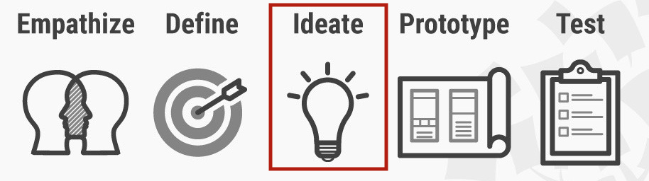
Although Ideate is considered the most expansive stage, where more ideas are generally better, the scope of this project was so large that we needed focused idea generation, otherwise this stage might never end.
In order to do this, we looked at the processes and tools identified in Define, through the lens of user needs and pain points derived in Empathize. In other words, ideas needed to first solve existing problems before providing additional gain.
As anyone who had done continuous discovery can tell you, these bonus solutions come up all the time. An example in our case was that the adoption of a maplike interface for content – solving the problem of the lack of a common overview – provided the basis for batch approval and pre-population of a flowchart view. One solution leads to another.
Ideate to reduce tool complexity
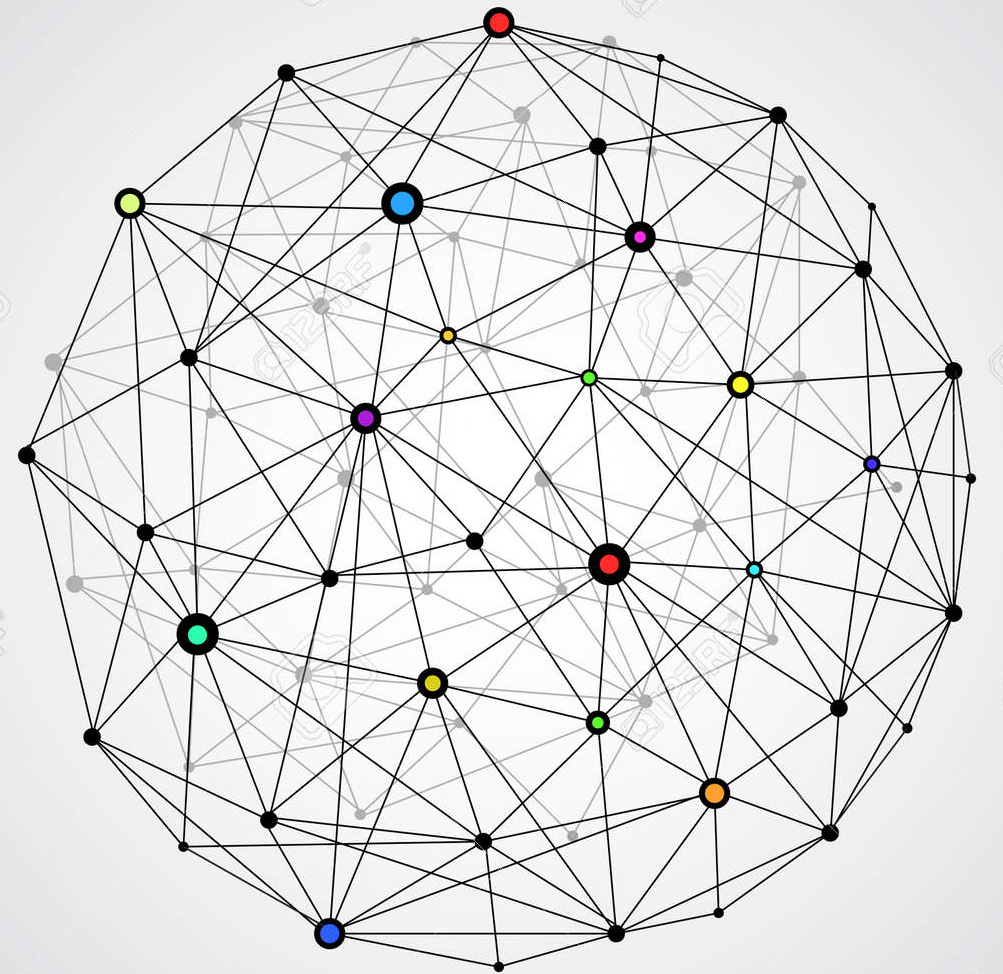
Returning to the tool universe diagram, highlighted with the those that were considered candidates for integration.
The process work done in Define showed that campaigns had a lifecycle, very roughly: creating foundational narratives, brainstorming content, selecting and scheduling content, planning and creating the means of delivery of content, going to market, measuring and iterating.
Some of the tools in the marketing toolset had little to do with this core process. For example, Optimizely, which enabled A/B testing, was a means of refining content, an optional step. This type of functionality was brought in later via API.
Brainstorming against complexity revolved around breaking down the silos that core tool separation created. If not wholesale merging tools, then auto-populating downstream tools with upstream outputs.
Ideate to reduce artifact complexity and rework
Excel spreadsheets, Word documents, Powerpoint diagrams, emailed between team members, or sent via Slack….this is how information about campaigns was being shared. It was not always apparent what the most up-to-date version of a document was, and often data would have to be recopied into a new tool.
Fortunately, moving standalone documents to the web solves for this. Spreadsheet data, text, metrics, even diagrams, can all be web-enabled. Handoffs can be pre-populated. If actual document artifacts are required, an export function creates them.

Ideate to facilitate shared understanding
Marketing campaigns take users through predictable stages, from discovery through purchase and beyond. Asset delivery is calibrated to the customer’s mindset at the time, with greater engagement as the customer moves through the funnel. A potential customer in discovery mode is far less likely to fill out a form for a software download than, say, one who has attended an event.
IBM was not providing internal users a means of visually mapping assets, delivery methods, events, and guidance to these stages. Instead there were discrete documents per stage, for example asset lists for customers in the Learn stage. We wanted a way to portray the entire journey, and to contextually deliver customer insights along the way.
As mentioned in the Empathize stage, campaign teams would work asynchronously, that is, they would come into the planning process at different times. Without a centralized single source of truth, it was more difficult for them to internalize context: guidance and work that had been done prior their participation.
For example, a digital specialist would have a more difficult time designing a social media strategy without seeing the narrative statements and themes applied per buying stage, per buyer profile, by the Portfolio Marketing manager – a step that occurs early in the campaign planning process. My goal was to make this type of information always-on and always editable.
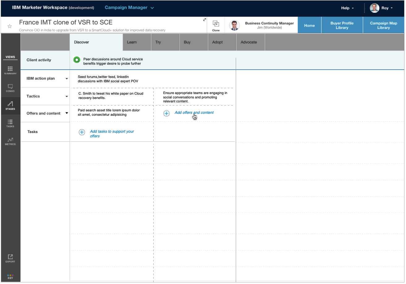
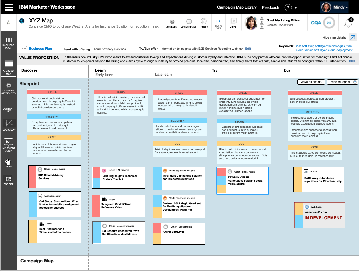
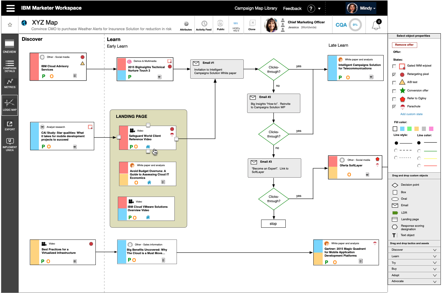
This early prototype offered a “campaign map” area where multiple users could add and edit content per marketing stage, via a tabbed interface. Users started these “Campaign Maps” by going through a wizard. One of the steps in the wizard was to select a customer type, a “buyer profile” for the campaign. Metrics and buyer insights were offered on a separate page. This brought two applications together in order to keep the buyer front and center in all decisions.
Users could view a library of other campaign maps from here, and could also clone their campaign to be modified and adopted in a different country.
This prototype’s centralized work area was effective in helping solve the problem area of a lack of shared understanding and single source of truth, but user testing revealed it was failing to show a coherent overview.
Users found that the tabs for each buying stage (Discover, Learn…) hid content and fragmented the marketing journey. They often had to keep clicking on tabs in order to reveal where they had previously placed an asset. Assets were place via a modal window triggered by a “plus” sign link.
In an effort to reduce tool complexity, this prototype again combined two tools, in this case the “Content Blueprint”, which provided a list of approved campaign content. The selection method first tried did not test well:
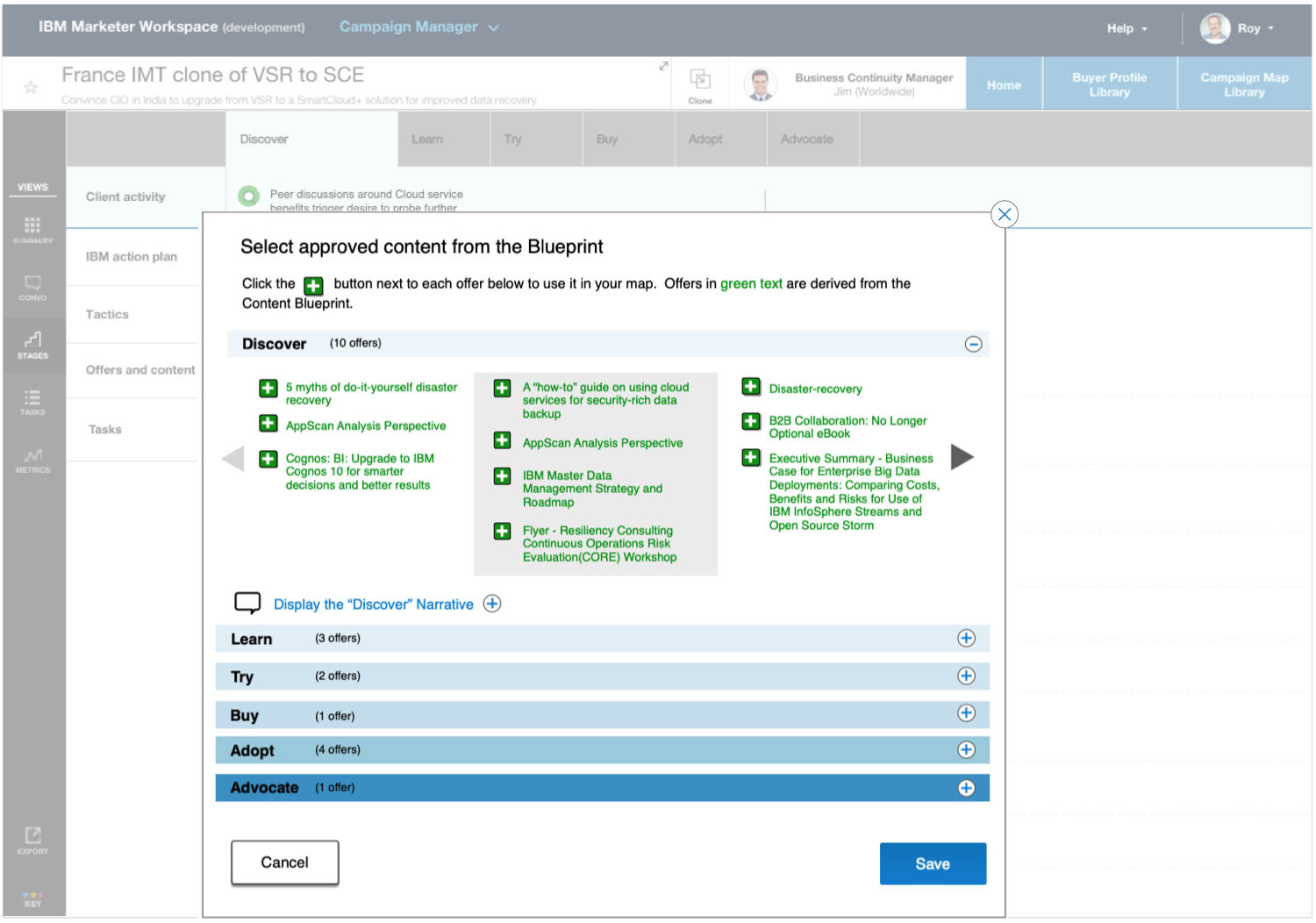
We used two of possibly the worst UI patterns to make this content available: a carousel and stacked trays. The rationale was to conserve space, since the system had to display all assets from every stage of a campaign. We were making things more complicated rather than less.
On being a scientist rather than a lawyer

I once had a business card that listed my professional title as “Chief User Zealot”. While it’s essential to advocate for the end user, I’ve learned that it’s a mistake to advocate for a particular solution, like a lawyer might argue a case.
Instead let user testing data do the convincing.
I knew the pattern shown above violated basic heuristics, but I thought it might work a stopgap measure, and a primary stakeholder was attached to it. So I shared my concerns and carried on. The pattern predictably tested poorly, we ended up changing it (see below), and my relationship with the stakeholder was preserved.
Evolution of the Prototype
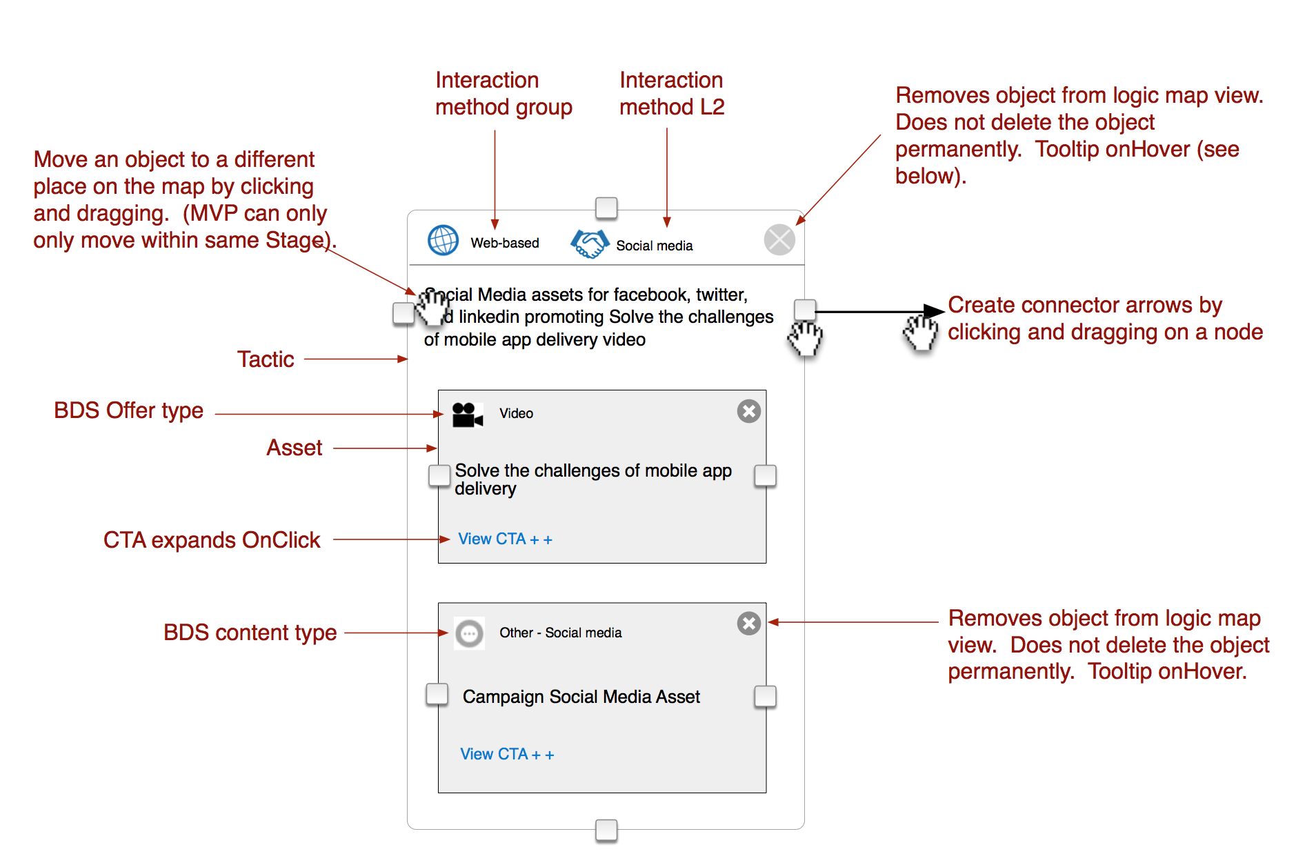
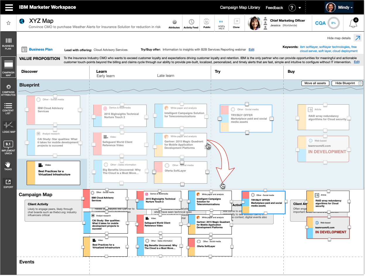
A better option was to redesign the Content Blueprint application and move it into the Campaign Map, leveraging the Campaign Map’s content selection pattern. An area at the top of the map was designated for Blueprint content. This provided a more intuitive interface and eliminated a handoff. Content managers and Campaign managers were now looking at a common artifact, they could develop content together, and see updates instantly.
This type of full-scale integration was only made possible was the implementation of drag-and-drop functionality for map objects. Flattened tabs now showed the full marketing journey, and users could drag Blueprint assets in and out of the campaign map, changing their status. Status was not just viewable on an exported list, it was immediately apparent from position on the map.
The Content manager has added assets to the Blueprint tray.
The Campaign manager selects assets for the campaign by dragging them into the campaign map tray.
Another integration/accelerator centered on how assets are delivered to the marketplace. Marketing teams bring their messaging and assets to customers through various channels: paid and owned media, email, paid search, content syndication, etc. They create “logic maps” – process flows of these channels and the ways customers respond.
Logic maps had been done in Powerpoint with the help of Digital Specialists. They would cut and past Information about messaging and assets into Powerpoint shapes. The diagram would show flows and dependencies, for example, did a user open an IBM email, did they click on a link?
When the flows were complete, the specialist or manager would create a second Excel file listing only those assets used in these flows. This would be sent along with the Powerpoint to an Enterprise Marketing Manager, who would load the data into an execution platform.
This system was the poster child for pain points: complexity, handoffs, multiple artifacts, multiple version, rework…. Why not automate as much of this as possible?
Fortunately, the Angular code base that was in use could support a graphics tool that was good enough to emulate Powerpoint. This function could pull in data from the Campaign Map to pre-populate the map with assets. It could also maintain a change log to export data tables and deltas for the in-market execution platform.
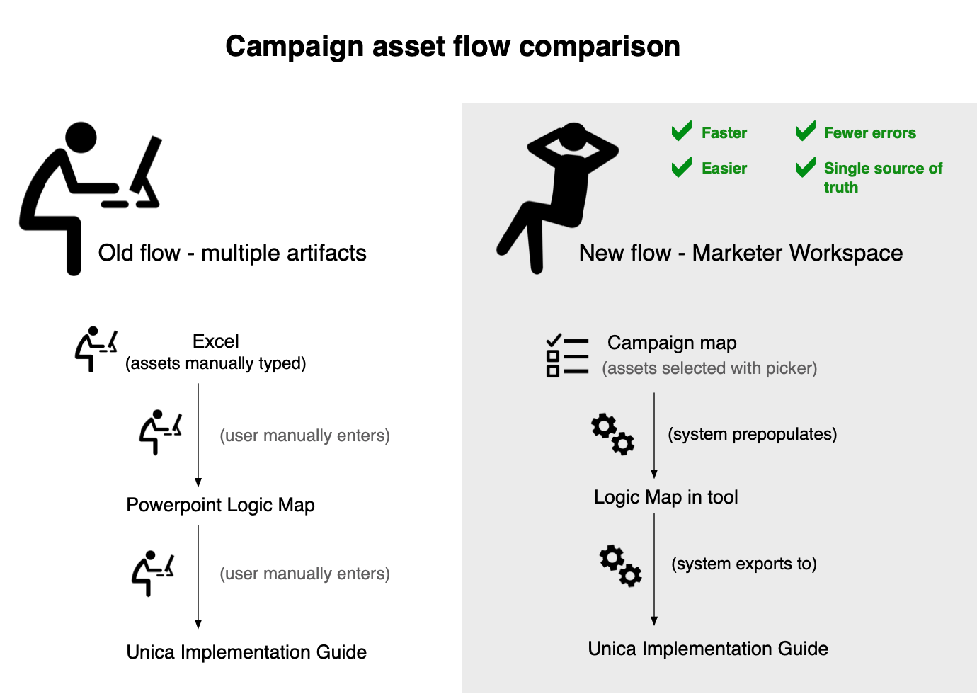
The Logic maps created by what was now being called “Marketer Workspace” could stand up to previous Powerpoint versions.
Optimizing this tool took many iterations. An early version stored assets in a “hopper” on the right side of the working area. User testing showed it was better for the system to add assets to their targeted stage, rather than have users drag them out.
User testing also revealed the singular drawback to this system, the export. Asset list export was fine, but the map export was a very large PDF. Given that our direction was to move away from documents and artifacts, this was a price we were willing to pay.
Outcomes
Marketer Workspace became the standard enterprise platform for IBM marketing, used by thousands of team members every day. New features were released regularly under the Agile framework, based on user feedback. Campaigns were being built more quickly, more accurately and with less effort. Over time, the Net Promoter score rose from -78 to 9.
Lessons learned
This was in many ways a dream project: great access to end users, a product that I knew would be released, interesting problems, and smart coworkers. And the knowledge that what I was designing would have a positive impact on peoples’ lives.
I also became a firm believer in Agile/Scrum. This project had many moving parts, but as a result of Agile sprints, I knew I could give intense effort and not be subject to the “human sacrifice” model of project management. Thank you product owners, you really were servant leaders.
I also learned the following:
- “Shadowing” users is the best method for learning the full context as noted in the Empathize and Define stages of Design Thinking. Unguarded users reveal their true priorities (see the prior section about metrics vs. reuse).
- Competition about who sets standards, for example which group’s naming conventions will be adopted, are about power, not efficacy. In these cases you must protect the user experience.
- Users’ “workarounds”, for example the Logic View Powerpoints, are fertile ground for new features.
- As was the situation with task management functionality, do not design tools which are not the result of a documented problem area.
More Case Studies
Also see my traditional Work Samples
Case study: Responsive Trip Configurator
It’s much easier to take a spontaneous trip when you can “make it up as you go along”.
Case study: The Dual Role of UX in the Discovery of Complex Systems
Using UX skills to give your team an overview of a complex system will enhance shared understanding and open up new areas of discovery.